I came across a provider website the other day that impressed me as being extremely patient-centered. I then took a look at several more provider websites (two of which are in my own hometown) and noticed a huge difference in the total “look” and appeal (or not) of provider websites. In looking at some of them, I wondered, “Do they really want to attract patients or not?”
Take a look at this website:
http://www.healthpartners.com/public/
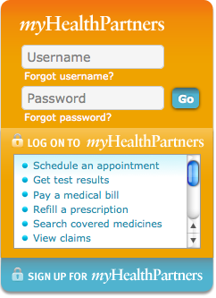
It is attractive, easy to understand, clear, and uncluttered. It really looks like it is designed for the patient to use. When you sign in to the secure site for patients, you can see what will be on the site ahead of time.

Patients can schedule appointments, find a doctor, get their test results, pay bills, etc, etc all online and it is easy to navigate and really looks user-friendly. I love this!
They is also an index at the bottom of the page with a comprehensive listing of offerings such as a wellness site with “decision tools” that can be used to make decisions about treatments or surgery and a “virtual coach” that can help with exercising, healthy eating, positive thinking and other healthy lifestyle issues.
There is a health information library and a pharmacy section.
Everything is clear and well presented.
And – it seems up to date. The news articles are current (the last one being March 26th and it is March 31st today).
And they offer a mobile application and a site in Spanish!
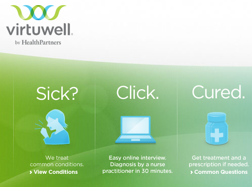
Even more! They have a separate site called Virtuwell which is a 24/7 virtual online clinic.
I am really impressed with this feature! You can go online, choose which symptoms you have, get an interview with a nurse practitioner and a diagnosis and then get a prescription for medication right away! How cool is this!
Virtuwell is $40 or less per visit, depending on the patient’s insurance plan. And if for any reason, the patient is not satisfied, Virtuwell will refund the money. Now THAT’s customer service!
Virtuwell only treats certain conditions but this includes flu and cold symptoms, bladder infections, deer tick bites (including Lyme disease symptoms), ear pain, yeast infections and more. They advertise an online interview with a Nurse Practitioner and a diagnosis within 30 minutes.

Watch this really short and clear video about Virtuwell:
To recap, the HealthPartners website has some great attributes that make it patient-friendly:
- It is clear and uncluttered
- It is user-friendly
- It has an easy-to-read comprehensive index
- It offers a wellness site
- It is interactive
- It has a 24/7 alternative virtual site with visible pricing
- It is available in mobile
- It is available in Spanish
My question is this:
“Why don’t more hospitals have sites like this?”
Take a look at your provider’s website. Or, if you are a provider, take a look at your own website and compare it to this one. Is it really patient-centered? Is it easy to understand and navigate? Does it offer patients information about decision-making and wellness issues?
It’s time to get with the program and become person-centered!
If you like this post, please read other posts in the series on the Person-Centered HealthCare main page. And if you have a story to tell that may be a fit with our series, please comment below or email me at joan@socialmediatoday.com


