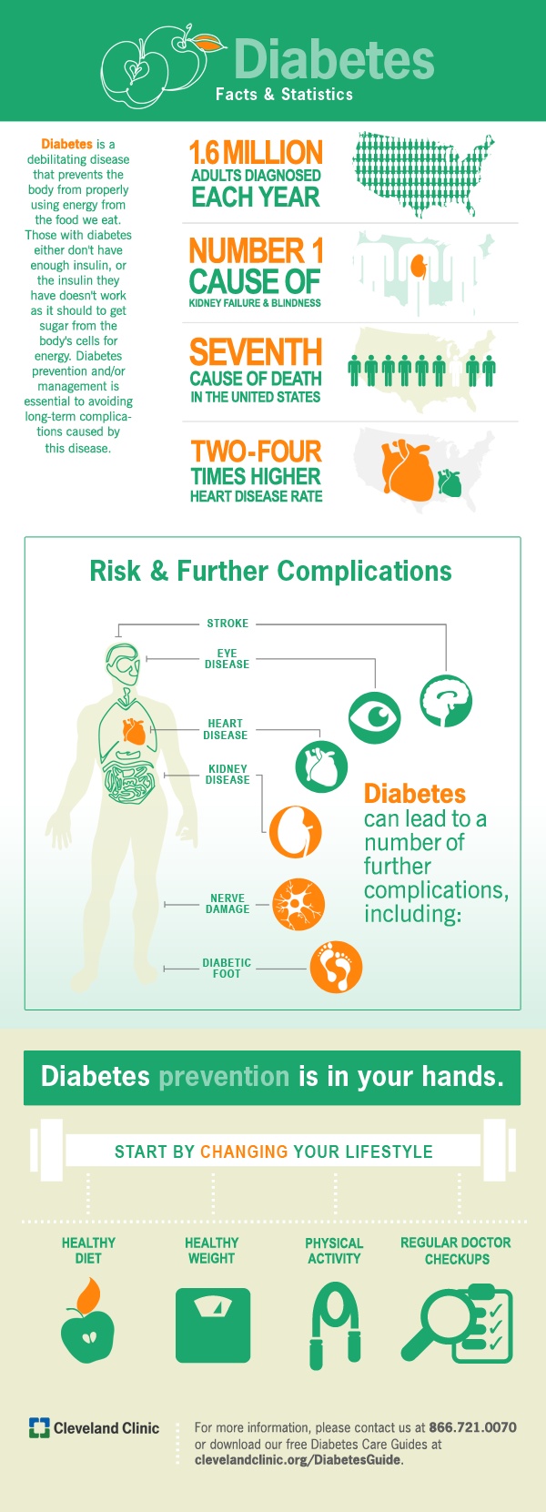
Data is easier to understand when it’s presented visually. But sometimes graphic designers get wrapped up in making content beautiful and forget to make it functional.
Here are two things to keep in mind when creating an infographic:
Data is easier to understand when it’s presented visually. But sometimes graphic designers get wrapped up in making content beautiful and forget to make it functional.
Here are two things to keep in mind when creating an infographic:
- Know your audience. You can’t help your viewers make a decision unless you know what they’re looking for. Ask yourself: How will patients read and interpret the information? What do they know already and what do they want to find out?
- Tell a story. The right graph and data range should convey a compelling narrative. Create a visual that helps the viewer observe, understand and make sense of the information.
Great healthcare infographics:
