You know that joke about the drunk crawling around under a street light? A cop comes up to him and asks what he is doing. The drunk explains that he is looking for his wallet. The cop, getting ready to help the man, asks where exactly he dropped it. The drunk points to a distant corner of the dark side of the street. The cop, baffled, inquires why the man is looking here. With inimitable logic the drunk responds, “This is where the light is.”
You know that joke about the drunk crawling around under a street light? A cop comes up to him and asks what he is doing. The drunk explains that he is looking for his wallet. The cop, getting ready to help the man, asks where exactly he dropped it. The drunk points to a distant corner of the dark side of the street. The cop, baffled, inquires why the man is looking here. With inimitable logic the drunk responds, “This is where the light is.”
What does this story have to do with anything? Well, I went to a great HIT tweet-up in Cambridge yesterday, organized by Scratch Marketing and led by Janice McCallum. No, they did not at all remind me of the drunk in the joke. But the lively discussion about data by about two dozen attendees inspired by Janice’s thoughtful presentation certainly made me realize that our healthcare policy is like that drunk. Here is what I mean.
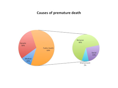
So, if the probability of premature death due to a public health-related condition is 60%, why are we only spending 3% of all the healthcare dollars on fixing it? Another way of posing this question is, if the probability of premature death from issues related to access to adequate medical care is 10%, why are we spending 97% of all the NHE on that piece of the pie?
If this isn’t just like that joke, I don’t know what is. Only in this case it is much less funny than in the case of the drunk.


